INTERFACE DESIGN
BAD INTERFACE DESIGN – WAZE APP
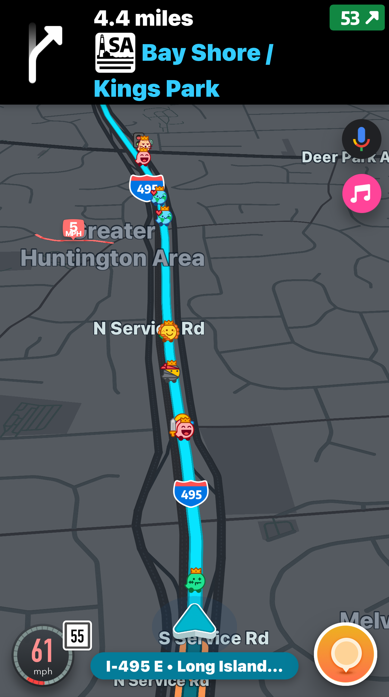
In the course of your daily life, you’ll often find yourself exposed to poor design choices. This can be in the form of a direct mail promotion or something much more mainstream, such as a very popular product that everyone uses. You don’t necessarily have to be sensitive to poor design to recognize it in the real world, but the outcome will be minor irritation or outright frustration. Recently I recognized this in product I use almost every time I get into my car, the Waze Navigation app.


FAIL!
However, it has a major interface flaw. It is so glaring and so irritating, I’m dumbfounded as to why it hasn’t been corrected in the dozens of updates that have occurred since its inception.
INTERFACE DESIGN
What Makes Waze Great
I’ve been a Waze user for quite some time. It’s a simple navigation app that competes with Google/Apple Maps and provide realtime guidance for getting to your destination. It has its quirks, such as rerouting you from a highway to secondary roads to shave off a mere two minutes, but its real “Jedi Power” is telling you where cops have set up speed traps. It’s very effective at this and is why its more popular that the other navigation apps available.
However, it has a major interface flaw. It is so glaring and so irritating, I’m dumbfounded as to why it hasn’t been corrected in the dozens of updates that have occurred since its inception.
What Makes Waze Bad
Now Waze my retort that they display the exit and the correct lane to be in just prior to the turnoff, but so what? Why do users have to crane their neck and squint their eyes to see the exit number when the notification first arrives on the screen? Looking at a navigational aid is distracting enough, why make it even more so with a lousy design decision?
For such a large company* with a huge user base, it’s unacceptable that this hasn’t been corrected. However, the first step in fixing a problem is admitting you have one…
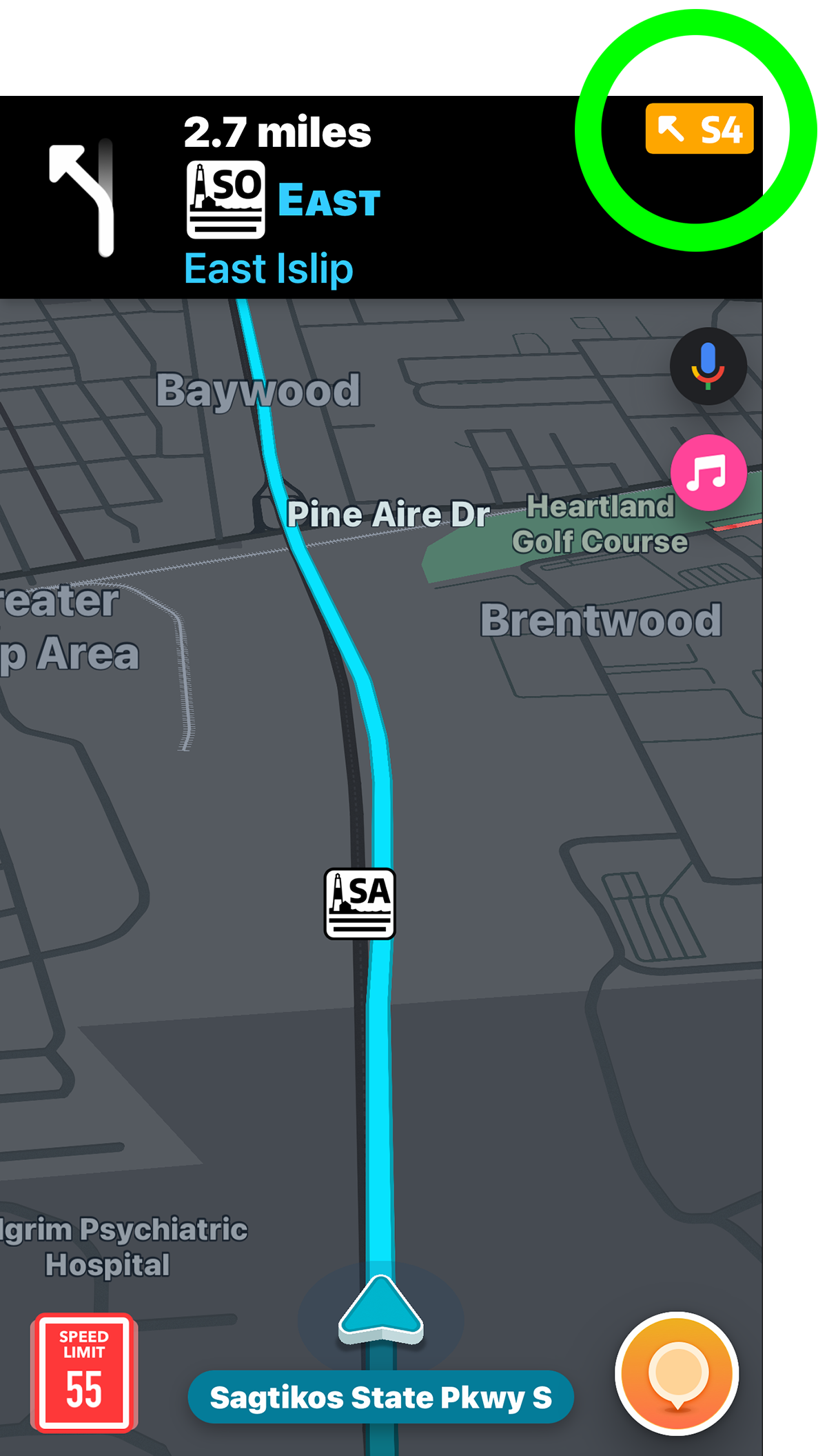
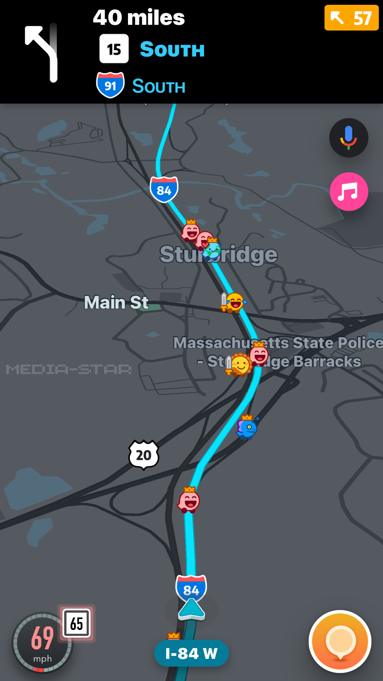

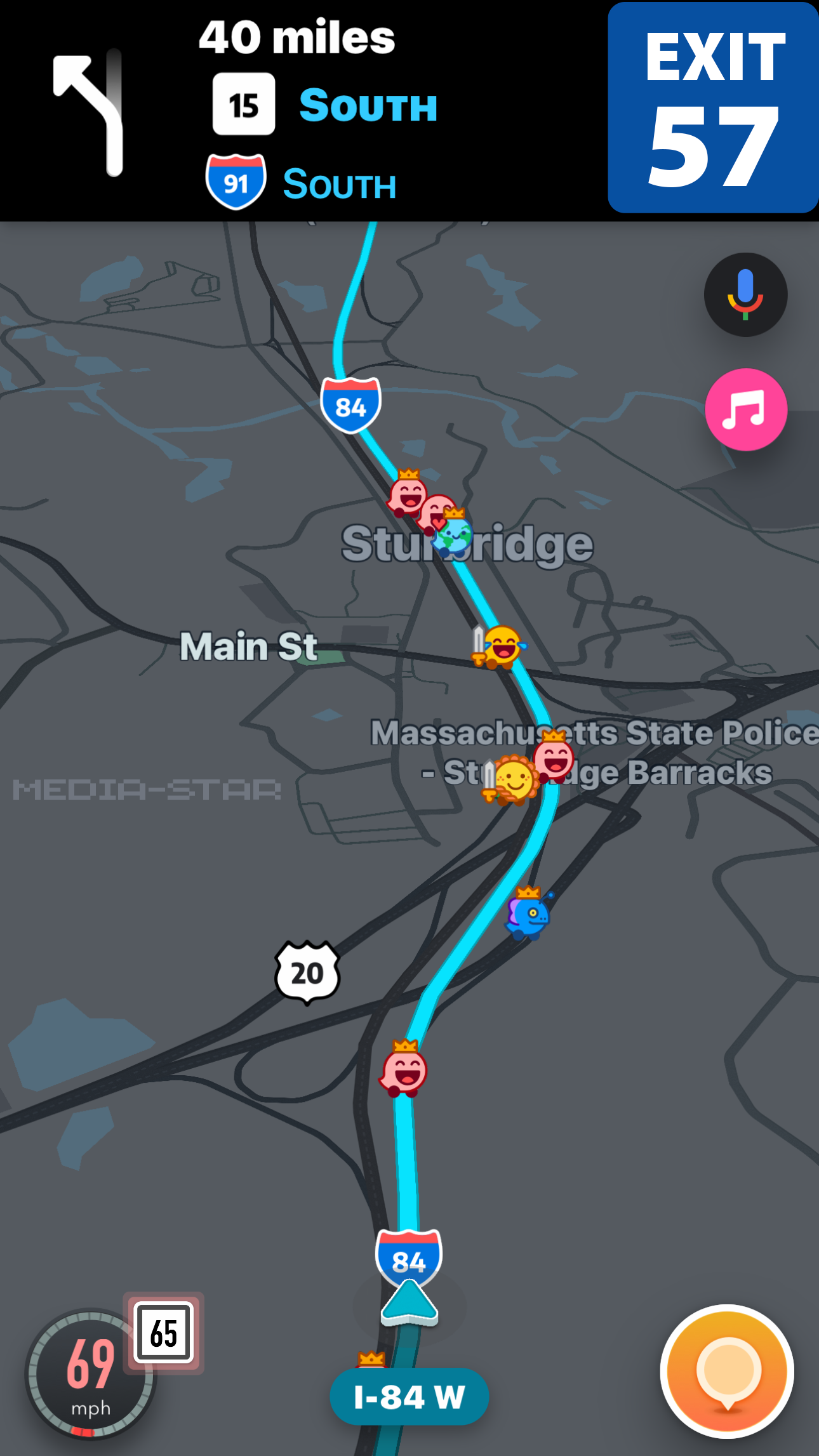
It’s hard to understand why Waze doesn’t change their graphical user interface (GUI) to make this modification for the good of all, but if you agree, let them know!
*Google bought Waze for $1.3 billion in 2013.
WAZE INTERFACE DESIGN IMPROVEMENT
Exit Notification Modification

JOURNAL
Recent Articles
Power-Of-10 Website Development
Media-Star created a new website for the Power-Of-10 Fitness Book by New York Times bestselling author Adam Zickerman…
How Fake Survey Sweepstakes Hurt Your Company
Thank you for your purchase. Share your thoughts for a chance to win!
Have you ever purchased an item and then received an email asking you to fill out a survey about your shopping experience for a “chance to win” some sort of random sweepstakes? Sounds like a decent proposal, right? So you went ahead and filled out the survey and…nothing! You didn’t win. Well, here’s the reality. No one ever wins. The whole thing is a lie…
Ballistic TV Acquired By Media-Star
Ballistic TV, the sport action video production concern has been acquired By Media-Star…
Don’t let this happen to you. Call Media-Star today!
917.819.5300
Long Island, New York


